New graphic identity and website
In May 2020 I decided to take the big step: to start the process of reorganising my online presence, redefining my graphic identity and my website.
What encouraged me the most to start this process was having the opportunity to work with a great professional, Marina Pla, who I met thanks to the Ciudades Comunes project for which she designed the graphic identity. After that incredible online event, in the middle of the pandemic, I decided to trust her for my new “Digital Identity”.
You can judge the result yourself.
I love it!
More than a year later and thanks also to the development work of Santiago Espinosa de los Monteros from Dataira and the technical support of Alfonso Sánchez from Montera34, where I have hosted the website, the process has finally reached its final phase with the launch of the new version of the website, which will be followed by the update of my graphic image in the different social networks.
It seems absurd, but the main objective of all this is to solve a paradox in which I have felt trapped in the last few years. I am referring to that strange feeling related to the will/need to take care of my own personal brand that ended up feeding in me, more and more, the perception that every new content I produce and publish, is actually the result of the need to have to sell myself as a consultant. For this reason I ended up losing the desire to publish any kind of content online.
To be honest, it’s not that I totally lost the desire, but I found it more and more difficult and so when I felt like it, I actually took advantage of it to experiment with new formats, which in reality in many cases I didn’t give the continuity I would have liked.
The first push to change this feeling of commercialisation has been the podcast (for now only in spanish). I started recording it a little over a year ago, just at the same time as I began to think about updating my online identity, managing to publish the first chapter at the beginning of this year. With the podcast I am managing to maintain an almost weekly publication regularity. It’s a format that has given me back the comfort and enthusiasm I need to share about myself, what I do and what I think.
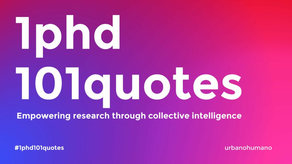
My last big online campaign was the one I tried to carry out at the end of last year with the attempt to finish my PhD with the incredible campaign, 101 quotes for my PHD, which in fact also served to re-awaken my desire to do streamings and intensify my interactions with those who follow me on the networks.
One exception has been my newsletter, which I still send out from time to time. The format is a hybrid that mixes the personal and the professional, I would say with a touch of intimacy. If you are interested you can sign up here.
So apart from the podcast, my online presence lately has been kept up by retweets of other people’s content and simple comments based on three simple letters and an exclamation point: OLE!
Let’s now take a look at two projects that have completely changed my professional dynamics. They are of course fairbnb.coop and Volumes. In fact, the great novelty of the last 3 years has been my commitment mainly to these two projects, to which we could add Ciudades Comunes, and the one that is now on standby, Civic Innovation School.
The Fairbnb.coop project has been the first to offer economic stability, with a monthly income that we could consider fixed. It is important to clarify that in this project I also started with a bet without remuneration, only after almost a year is when I started to have this monthly remuneration that has managed to give me this economic security.
In the same way, for a few years I had taken up my role as a partner in the Volumes project in which I was in charge of communication, and where today I am in charge of activating and coordinating the whole process that will lead us to what we call Volumes Media (I will share more details very soon).
Thanks to these two projects I have managed to reduce the noise in my activity and not worry about having to look for new sources of income “disguised” as projects. This is what has allowed me to relax and offer myself the incredible luxury of publishing contents again without that strange feeling generated by the need to “sell myself” as a professional.
For this reason I have finally been able to find myself in the situation to make some important decisions.
To start with, the name Urbano Humano is simply my digital alias again, it has nothing to do with any agency or selling services, and that’s why you’ll notice two things:
The new logo is a bit “unstructured”, that is to say that it doesn’t allow you to clearly read Urbano Humano, this is because I’m not interested in affirming and selling that name. If you follow me and you know me, you already know that it’s me, Domenico Di Siena, I don’t need to reaffirm the Urbano Humano brand; and for exactly the same reason, my name appears in the logo, which is the most essential thing to communicate, that is to say, it’s me. That’ s it. Surely those who work in marketing and communication will think it makes no sense and is crazy, but I love it and above all it makes me feel comfortable.
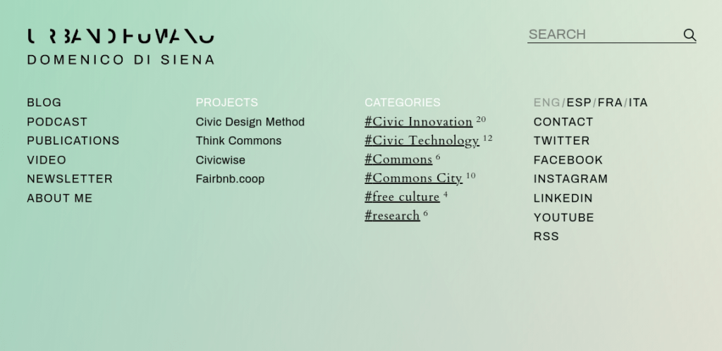
The website does not focus on presenting my work or describing who I am and what I have done, but I have preferred to give more relevance to the contents. The web does not want to sell me, but simply to facilitate the access to my contents. That is why its structure gives a lot of space to the menu and to the possibility of visualising the contents according to different categorisations, based on the type of content, the project to which it is associated or the subject matter, and of course with the possibility of choosing between the 4 languages in which I usually work: Italian, Spanish, English and French.
I also wanted to keep two priorities in mind: the speed of loading the page and the format for smartphones. This means that from the technical point of view, everything is designed to generate a development created from scratch that eliminates everything that I don’t need and that can slow down the loading of the page. On the design side, this means that we started with the mobile version first and then went on to design the computer version.
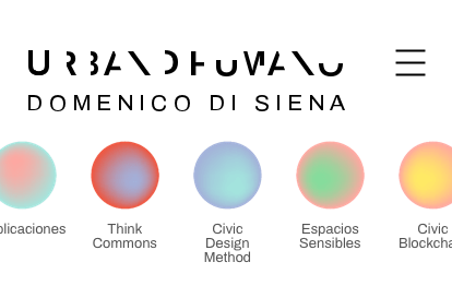
For the mobile version there is a menu that reflects the kind of navigation that is now often found in mobile apps with the typical little circles to access the Stories.
I really hope you like this change. The most important thing for me is that I feel very comfortable with this new graphic and it really makes me want to publish content again.
I hope you’d like to leave me a comment, with suggestions and feedback.